

For 36 years, The Resurrection Project has grown alongside the people, families, and neighborhoods that first brought it to life. What began in 1990 as a grassroots response to disinvestment has grown into a trusted ecosystem on Chicago’s Southwest Side and across the country. Rooted in organizing and collective action, TRP provides comprehensive services in affordable housing, immigrant justice, financial wellness, and legal representation.
As our communities’ needs evolve, so must our work—and how we tell our story. In this spirit, The Resurrection Project is proud to introduce a refreshed brand identity that brings greater clarity, consistency, and connection to everything we do.
Grounded in our renewed mission to build community and champion justice so that immigrants and families have the power to shape their future, these brand updates reflect who we are, what we believe, and how our work continues to meet the needs, hopes, and leadership of the communities we serve.
Today, our work is united by two pillars: Housing and Immigrant Justice. Through these interconnected areas, we help immigrants and families access safe, affordable housing, build generational wealth, protect their rights, and advocate for their neighbors.
Our updated visual identity, tagline, and logo system are designed to help every audience immediately understand the breadth of TRP’s work and the values that connect every program we offer: community, justice, character, and conviction.
The Story Behind Our New Logo
The refreshed TRP logo was designed to carry meaning in every element. The sun serves as an homage to our history and culture. The original TRP logo depicted the Aztec Sun alongside an illustration of St. Vitus Parish and the original homes we built.

This is the original logo from our founding 36 years ago.
Our previous logo, used from 2019-2026, introduced the “tree” of services TRP offers. The design also drew inspiration from Aztec arrows.
Our current logo honors TRP’s past while looking toward the future.
The “T” extending over the “R” conveys shelter, protection, and care. The “R” supports the “T” as a visual foundation. Together, those elements represent shelter, foundation, vibrancy, and a shared structure built to hold people up.
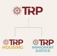
By creating one unified family of brands under the TRP umbrella, we promote cohesion. Across the many ways we serve, we are one TRP.
The Next Chapter is Ours to Build
Thirty-six years later, this same belief remains at the heart of TRP.
It lives in the family opening the door to a home of their own, in the immigrant receiving trusted legal support, in the neighbor finding their voice and using it to advocate for their community. The fundamentally TRP belief that our future is ours to co-create lives in the partners, organizers, and community leaders who come together because they believe in our work and in the collective power to shape what comes next.
Because this next chapter isn’t really about a new logo.
It’s about what we will build together next.
Arriba y Adelante
– TRP